©Verte Photography All Rights Reserved

Showing posts with label Props. Show all posts

Tuesday, June 4, 2013

Tuesday Tip: Senior Portraits

Summer is rolling around and for many of you that means.... 

HIGH SCHOOL SENIOR PORTRAITS! 


Since I myself am all ready booking, I thought that I would make it easy, for my clients as well as my readers to get some great tips on what to wear, bring, etc to make your senior session a success! 

Today we will be talking about ideas for you, and general Senior Portrait suggestions! If you are having portraits with me... these are my recommendations! If you are having portraits done with another photographer, you should take these as general suggestions and talk them over with your photographer. Since each person uses different tools and creativity to produce your images they may have their own rules, guidelines or suggestions.

  1. Think about your location. Are you doing portraits indoors, or outdoors? 
  2. Think about your style. This is a session about YOU. Your clothes, accessories and make-up matter. Let them tell your story.
  3. Think about who your giving them to. Your grandmother loves you. She may not love seeing you dressed to go clubbing.

Personalize your session.

When you schedule your appointment, I will work with you to find the right locations. I have several "go to" locations, but I want your portraits to be a reflection of you.

Punk, skater, or rock and roll: Graffiti walls, brick, or more urban and edgy locations fit the bill.
More country or casual: Then we can look for a barn, hayloft, horses... railroad tracks, tall grasses and old fences. The more information you can provide during your consultation prior to scheduling the more I can offer personalized suggestions and options. 
Feminine, traditional or classic: Flowers, lakes, parks, green grass. 

BYOP: Bring your own Prop! Skateboard, football, ballet slippers, or an instrument. Bringing something that shares your interest helps tell your story!

What to bring:


Clothing Changes. I ask that you bring 3-5 clothing changes (if possible) to your session and even some extra accessories, shoes, and jackets or sweaters to change the look easily. I will then assist you on what will look best for your shape, coloring and setting.  The clothes will then be edited down to the best of the best!

When selecting outfits I recommend that you avoid large stripes and too many patterns.  Choose clothing that will best fit your shape and body style.   

You should always bring things that you love and fit your personality. However, I also suggest you bring at least one  “classic” look as well. If your a girl and you NEVER wear dresses... don't bring one. You will be uncomfortable, and it will show. Instead opt for a nice shirt or sweater, even a jacket that can be put on to create a "Grandparent friendly" or classic option! I understand that if you are a bold, trendy person it would look unnatural to put you in a baby pink button up! You can however do a solid color stylish cut shirt, in a bold color, or even a classic white with a showcase jewelry piece!

That being said I still love trendy, fashion statements... I love when someone has a unique look and really owns it. I just suggest you create a little balance, a compromise for just a few shots, and think about how your outfit will look hanging on Grandma's wall! I'm a parent, I have to say it!

 I suggest also that you think in layers, bringing along a few simple options like a jacket or sweatshirt that can be slipped on and off can help give you different looks, and be more suitable especially if your on location and walking around! 

Shoes. Don't forget different shoes... if your going formal, bring a formal pair of shoes... casual we can do bare feet, or sandals.... but be sure they are in good shape, and clean. I will do full body as well as close up images, so your feet and shoes will show!

Accessories: If your bringing jewelery, I suggest you pack it carefully so it doesn't break or get tangled. Bring it in a pouch or something that wont be lost easily! 

Makeup/Hair: For most clients I suggest you come with your hair and make-up already done. If you would like me to schedule a hair or make-up artist to do this for your prior to your session, that can be arranged however you will be responsible for covering the additional expense.  

Ladies should remember to bring extra lip gloss or lipstick, and powder to help with shine.

You should bring your own comb or brush, hairspray and small water bottle for location shoots. If we are in the studio, I will have plenty of these items around.

Tip: Verte Photography is not responsible for hair dissatisfaction since we are not familiar with your preferences, tolerances for styles, locks or strands. Retouching is done at the client's expense

WATER! While, again I have this in the studio, you should bring 2 or 3 times more water then you would normally drink when your outside. Being a model for a few hours really is HARD work, if your outside and walking around on location you will be thankful for the extra refreshment!

Bring your own Sherpa: I always recommend a friend or loved one come along with the senior. Not only can they help carry your items on location (because there is a lot!), but it sometimes helps you feel more comfortable to have a friend! They can help check your hair and remind you to fix make-up and things as well! While I am happy to help tote items, and always check your details... I do have my own pack of goods to tote and an extra set of eyes is always helpful! 


Verte Extras:
I offer my clients a portable changing room for location shoots. It isn't glamorous, or spacious but it does provide privacy in public areas. However, I do limit full clothing changes to 3 per hour session so that we don't spend all of our time changing clothes!

If you plan on adding a make-up or hair service contact me directly before you schedule your appointment. We will need to co-ordinate the services and times appropriately.

Typically an outdoor session is 1 hour, depending on location. Some locations may require more walking time to get from spot to spot. I never suggest a shoot last longer then 2 hours. I never limit my clients on a number of images. I shoot way more then you will ever need. Trust me.  

I offer all seniors a free digital yearbook image, or depending on the school 2 wallets. I ask each senior to bring, or email me the school information regarding portraits.

Verte also provides 1 free social media image, for each senior to share online with each package, and a 25% discount for a graduation session, that you can use for announcements or collage applications during the spring the following year.


Thursday, May 23, 2013

A Crafty Gal

 It seems only fitting that I do a introduction to the woman behind Crafty Gal Creations. Pam has been a client of mine for so long, and I use her items as examples here all the time!

I first met Pam when she opened her business in 2010, she was looking for a product photographer who could "think out of the box". A typical white background... just not Pam's style. It was a natural fit! Pam looks for scenes and props to be used with her jewelry to really open up the imagination of her buyers. She feels that this really separates her from so many other shop owners. Pam also finds that she is picked up, and showcased in many treasuries on Etsy due to the more unique style of images she has!

Pam created her business because she was tired of department store, mass produced items. Pam found a passion in jewelry, so much so that before she knew it she had made over 100 items! She had to start selling. Today, Pam is so proud to have a shop where each and every customer feels like they are her only buyer. Pam exudes customer service and provides quality products at extremely competitive prices. While her store began as a hobby, it grew to be Pam's therapy. She finds herself the happiest when she is alone and quiet in her studio with her beads and stones. If she could do it for her sole income, she would!

Pam's best sellers are items with Earth's Natural stones in them, which is fitting because it is where her passion lies, she loves working with them. She does offer other items, and non natural stones, but that's not her focus. Combining the fact that she works with these Earth Natural stones, and that Pam only creates only one of a kind items creates an EXTREMELY special product, that she often refers to as her treasures. She jokes (at least I think she jokes) that she finds often finds it difficult to pass on something she has created because she loves each of them so much!


Recently, Pam has been making items with a little more "bling" in them. Since she has had many requests for these items. She is currently trying to have a few of these new items in her shop at all times to provide some variety.  I have to say I have LOVED seeing these in the studio! This one might be my newest favorite!
    

Pam finds inspration in many different places, including seeing a piece of jewelry on someone else. She often sees something and thinks... "If I made that, I would have______" and then she goes home and she creates it!  Other times, she is simply drawn to a particular stone, and she will make several different pieces to showcase it. 
 
 
Even though Pam and I have known each other for so long, and I see her items in my own studio every 6 weeks or so, I still learned a thing or two about her while gathering information for this post. Pam is one tough cookie! She is a retired Army veteran... and flew in a helicopter during combat training! THAT is no run-of-the-mill helicopter ride. From someone who has been afraid of flying for a large part of my life... simply getting into a helicopter is something I'm not sure I would want to do... combat training... pretty sure that includes some quick turns and ups and downs... no thank you! I am SUPER impressed by this! 

For my closing note, I DO realize that I showcased most of the items with close up, detailed shots, I did this because Pam has paid such amazing attention to detail and crafted each item with care and love.  I very much wanted you to see those details!! She offers necklaces, lanyards, earrings, bracelets, bookmarks and SO much more in her shop... I literally never know what to expect from her... but I know I always love each item! I hope you enjoyed getting to know a little more about Pam, shes a fantastic client and I consider her to be a good friend! She's stuck with my business even after she also moved away from the Denver area, and has always been supportive of my goals! Pam does offer sporadic sales AND FREE giveaways for her Facebook fans. All of her sales and promotions are announced via FB, so take a few moments and like, love, and share this fantastic shop owners social media and shop links!
www.craftygalcreations.etsy.com             http://pinterest.com/pamsjewels/         http://www.facebook.com/pages/CraftyGalCreations/128737910505845

Monday, May 13, 2013

A Bow For Mama and MORE!

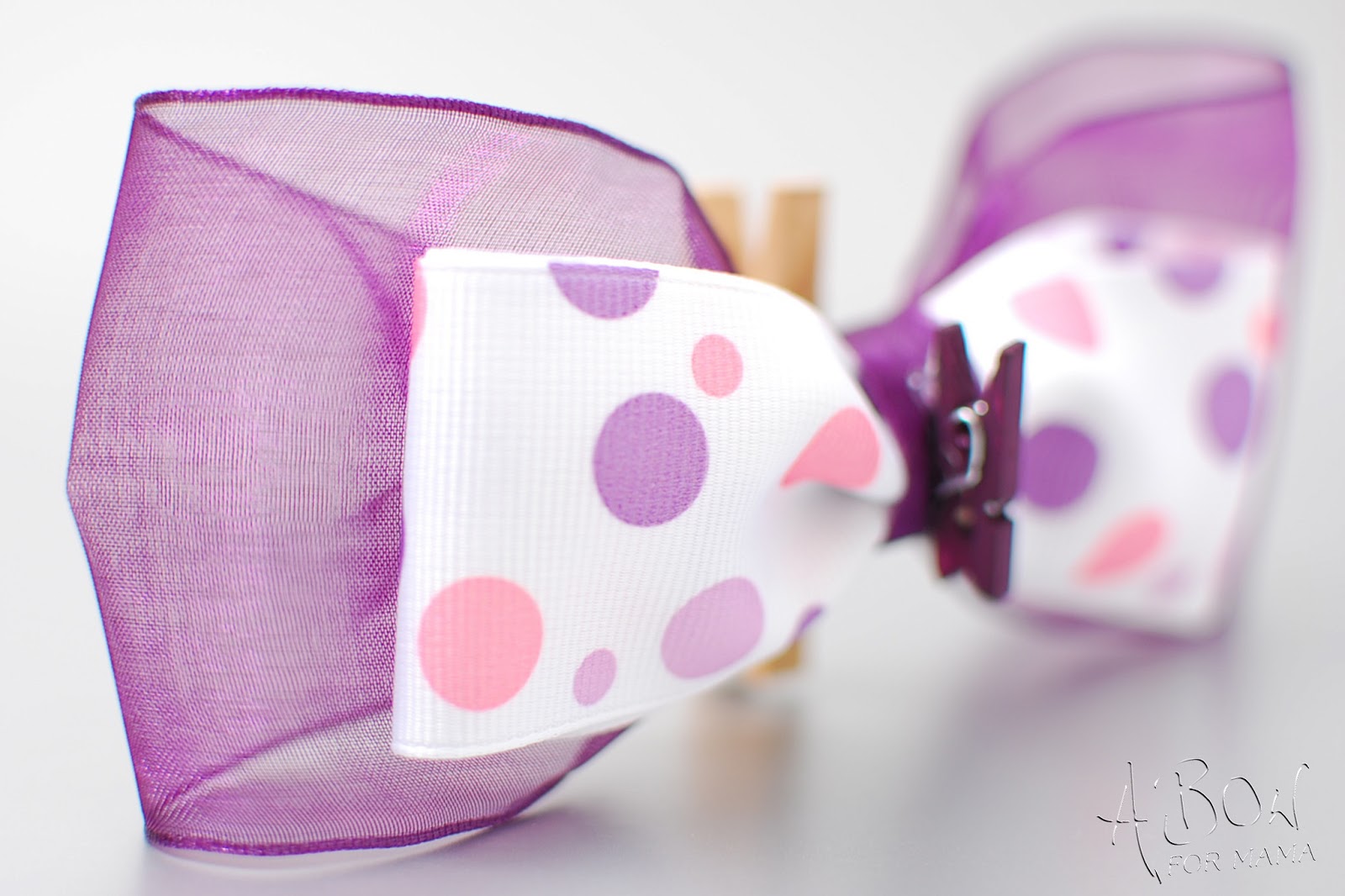
First, let me introduce Shirley, from A Bow for Mama. Shirley makes amazing decorations and bows that are used for all occasions. Baby showers, weddings, holidays, etc. ABFM provides your home, business, or event with the beautiful decor it deserves!

Each of her bows are handmade, they are packaged and shipped with LOVE and CARE, so that they arrive to you fluffed and beautiful! When Shirley contacted me and asked if I would take her product images for a new "super secret" product line! I almost died! I LOVE a good secret! I was fall out of my chair excited!!!!

 I received her boxes of goodies, and I could hardly wait to open them! I had an "idea" of what was inside, but to put my hands on these little gems - AMAZING!


As I unpacked the box, I was very impressed with the time Shirley had put in to separate the bows, and make sure they all floated so nothing got squished. While I did fluff a few as I was styling for her images, I didn't really "need" to! They arrived beautifully!  Now, these are not her regular bows... no this is something TOTALLY new for her! I am so excited that I finally get to share them with you! It was SO hard keeping this a secret!

These little prizes are her message board bows... or as I like to call them Little Bits from Heaven! They have 2 clips, one on the back and a smaller one on the front. I found SO many uses for them around the office as I was creating her "in use" images.


 On my pencil holder - perfect for holding reminder sticky notes or business cards I need to update in my client list...

Clipping recipe cards, or marking pages in my book.... 


As a housewarming, birthday or any celebration gift! It adds just the right bit of glam, who needs a bag! PLUS this is RE-USEABLE so the person receiving it can use it around their house again! I LOVE THAT!

I love the extra touch on top of gift boxes and bags... since they clip to message boards and can be ordered with magnets for magnet boards they make AWESOME additions to teacher gifts!

OH! Not to be outdone... but I found the BEST use for these babies! Clip them onto your napkin rings to hold a place card... TAKE THAT SANDRA LEE! Oh, and by the way.. you can stock up on the Eco-friendly napkin rings shown here... that's right with A Bow For Mama also! This makes the perfect gathering a little more special! Each guest can take the bow home with them, or you can use them yourself over and over!


Wednesday, March 20, 2013

The Background, pt 2

When is the best background for your product not white?

I often suggest a different background if the product itself is clear, opaque, white, or silver. I also love when an online shop creates a background that is unique to them, and sets themselves apart by creating something that reflects their brand or personality. So that is another great time to add some color!

While looking to make sure I covered the "hot topics" for doing your own product photography I asked my fellow TSUA-List members for their questions, and the subject of choosing a background other then white came up.  Thank you for those members who brought the topic of backgrounds to my attention! I put a lot of thought into it for my clients... and if your doing your own work... you should put a lot of time into it as well.

So what colors should you use?

Product provided by Crafty Gal Creations

Black: It is easy to find, like white you can use fabric or poster board for your small studio at home easily enough. It is solid, easy to edit and light. If your exposure is off slightly it is easy to edit in post production and it highlights jewelery especially silvers and golds very nicely. From a photography stand point it does not reflect light... so if you find your issue is TOO MUCH light on your image, this will absorb it.  If you have sheer cloth, or opaque stones and beads, or white products... this highlights them very nicely. Over all it is pretty forgiving and easy to work with.

Product Provided by: L. W. Hooks


Grey: I have to say... white, black and grey are the most common. Even when I was shooting families in the studio  - almost every skin tone, color combo and product will look good! For product grey is a solid choice if you want something a little different but not too "out there". Again it is easy to find, and forgiving if your exposures are not consistent. Grey, if you remember used to be how photographers balanced their film cameras! Grey is a neutral - it compliments all colors!

Now... you don't always need to think in solid backgrounds. I have several painted grey backdrops that I use.  Depending on the look for your shop, blog or other product use... these are great ways of adding texture or color, and creating a custom look. Just be careful not to get too over whelming with the amount of color or texture if you still want people looking at your product!


A gift from Colletta's Kitchen Sink during a swap I did!
Product Provided by: Streeter & Co

These are a couple of  custom backgrounds that I have hand painted - if you want to learn more about them you can visit my shop or email me directly!


Plus, Grey is not the only neutral in town!

Browns, tans, creams: Also great neutrals you can use for a variety of products, and colors. The tone of the background does really start stretching the limits of what colors look best on it. So you need to be careful here. Too yellow, red, or orange and your product may start to pick up those tones... especially in the whites. I tend to like something like the stone look below for shops with a more organic feel to them.
Product Provided by: Streeter & Co


While mixing a black with grey and brown provides another solid option for you, if you want something more custom looking but not so dark.

<<missing  new background image / Brice >>>>

Blues: Blues start getting very tricky. You have to use a little restraint and start thinking about your product and photography very seriously. It is easy to use the wrong kind of blue and to have that overwhelm your image like here you see the blue reflecting so much that the white starts to take on that tone like the image shown below.


Now, blue is still a very common color to use in studio photography. Typically you wont find it as a solid background, unless it is being used as the blue alternate to the green chroma key.  Where it is so overwhelming it is easily selected digitally and replaced with a different background. However, you will find it as a dyed background, or commonly paired with greys and whites in a mottled texture much like the tan and black are in  the image of "Brice" above.


There are exceptions to the rules and times when a solid blue can be your friend... say if your shooting something that is stone, or natural in color, seashells, or you want that "sea" look... stick with lighter shades of blues to accomplish this and help prevent the color bleed. Or if you have something that falls in the red, yellow, or orange category where you can use the blue to calm and add balance to the colors of the image, while highlighting the beauty of the product. Often it is best to work with something that has several shades of blue, or even white to help that balance.


Product Provided by: Crafty Gal Creations
Blues are very tricky for product photography, especially home product photography because you are typically not shooting with the best lighting gear. Poor lighting leads to blue images to start with... either from shadows, poor exposure, or the  light temperature of your light source.  My suggestion, stay away from solid blues and look for mottled, or pops of blue. Like this custom painted backdrop I made.
Product  provided by: Flynnster


Or by adding it in as a prop! Like this custom prop I created as part of Sweetsies Prop set. 

Cookies provided by: Sweetsies
Greens, reds, pinks, oranges and yellows: Unless you are a professional, and have the right equipment I would tend to steer you away from these background colors. Again, due to the nature of these colors they tend to bleed over into your product colors... reds and yellows are especially bad. Reds, quite frankly are even bad for you to WEAR during a photo shoot around your face, because it will make your skin appear more red and flush!


Not every item can stand up to such a bright background as well as this super cute guy... This type of bright background works great for kid products... but seriously.. you have to know what your doing or this will go very ---- VERY bad for you!

Plus, these colors will quickly overwhelm the eye.With skill and comprehension of the product and the equipment and lighting you have available, you can create great images with bright backgrounds. However,  if you are trying to create a custom look for your shop and that is a major part of your "branding" color scheme I would seriously consider letting me create a custom background where any of these color can be mixed into a more neutral based background, making it easier for you to work with! Too many images like the one above and potential shoppers could be easily overwhelmed! However, you should be aware of your product as well, below is a great example of a great background choice for yellow.  However, just like the blue we talked about a moment ago, it can bleed into your product... like below, this Smelly Jelly by Streeter &Co should be clear, instead it picks up the background color behind it and becomes more yellow itself! A lot of this can be overcome with proper lighting, and camera settings, but if you are starting out you may want to steer clear of the extra obstacles.


Patterns: Mixing up patterns and textures can be a lot of fun... I suggest being careful with the print and texture you use. I also find that people who don't have good lighting, or camera equipment, or who don't understand how to use it really struggle with making patterned backgrounds look good. Using depth of field and posing techniques to showcase an item becomes very important. Also, I wouldn't suggest posting a product like this lanyard with ONLY this image... make sure your following my other guidelines on using multiple images, posing, details and clarity! This can add interest to your shop... but it doesn't really show you want the item is!  - But seriously... HOW cute are the ladybug and bumble bee beads in there! I mean COME ON!

Product Provided by: Crafty Gal Creations
Golds/Silver or other reflective surfaces. These can look amazing. However, you really have to know what your doing. Since these backgrounds reflect light you want to work with that, instead of against it. Utilize your lighting to create a great effect. Like the patterns, I don't recommend this for your everyday image, or for someone just starting out... there is technique and an investment into time, lighting and camera gear required. However, when done right it can have a dramatic effect rather then just going with a black or grey.


Product Provided by: L.W.Hooks

Product Provided by: L.W.Hooks
It really makes for amazing detail shots! Much like the pattern, I wouldn't try to shoot all the images on a reflective background... just a standout... look at me, kind of shot. I've used the metal look to highlight the chain in the two crochet necklaces, and to pick up the sparkle in the threads of the crochet hat.


I hope this has gotten some wheels turning and helped you think about what you can use in your home studio! Don't forget to join me for "The Background, the final chapter" where I talk about what makes a good background, and what to look for when making or purchasing one, and how to pair the right colors with your product!


Wednesday, January 30, 2013

Time to Click: Last thoughts

As I close this series, I truly hope I have inspired, and taught each of you something that you didn't know before.
I have said it many time and I will tell you again in case you have missed it... I am an "explainer." That's my job. That's a passion. I LOVE to share my knowlage and give you the "why" not just tell you this is how you should do something... or tell you what a button does... but to paint you a picture of WHY you might want to use it!

This month was FULL of technical explanations, and loads of information... mostly so we have a place to build on together. I am focused and committed to expanding your photography world. I hope you will continue to be a part of the discussion and let me know what helped you, where you are still struggling... or even submit your images for review, and help! I LOVE doing that!

Now... I used to play a game with my class at the end of our basic photography series - So I thought I would do the same for you. Below are 5 images. Comment below, or send me an email (vertephoto at gmail dot com) 

Include: The name of the composition used (or compositions if more then one), and what type of mode (aperture, shutter speed, or scene mode) was most likely used. From the entries I will draw names and I will send you a surprise! Who doesn't like a surprise?

Here are the images: note: Not all of these are my images... some are simply awesome!


1.


2.

3.


http://wvs.topleftpixel.com/08/08/18/


4.


5.


Good Luck!


Monday, January 28, 2013

Time to Click: Composition

Did you know there are basic rules that photographers follow... it's not all technical and functional!

Composition from Wikipedia is described as:  the placement or arrangement of visual elements or ingredients in a work of art or a photograph, as distinct from the subject of a work. It can also be thought of as the organization of the elements of art according to the principles of art.
The term composition means 'putting together,' and can apply to any work of art, from music to writing to photography, that is arranged or put together using conscious thought.


So to kick off our "putting it all together" week... I thought what better place to start then the real down and dirty... core element of photography... Composition. 

There are several "rules of composition" that photographers commonly follow. Here are some of my fav's! 

(I have posted some of this prior, if it seems familiar... this is a much more in depth and inclusive list)


1. Fill the Frame with your subject. (imagine if Dad was shown... it would really limit what you could see of baby! Plus it would make him look HUGE because she is SO small!)


 #2 If your subject is TALLER then they are WIDE, shoot VERTICAL

#3 If your subject is WIDER then they are TALL shoot horizontally

Note: If you cant get what you need with your camera's zoom or lens, use your physical zoom... YOUR LEGS! Move yourself closer or farther to be able to fit your subject!
Leading Lines: When we look at an image our eye is naturally drawn along lines. These lines can be made from a background such as a road, bricks, steps, as well as using people and your pose to create it!  Look for lines within your image to create interest and tell the viewer where to look! Check out your favorite scenic shot... I bet you find a leading line in it!

Lines from the elbows up to the topmost head
Perspective or Viewpoint: Before photographing your subject, take time to think about where you will shoot it from. Rather than shooting from eye level, consider photographing from high above, down at ground level, from the side, from the back, change it up!
Angled Down


Rule of 3rd's: Imagine you have a tic-tac-toe board over your frame. It is separated into 9 equal parts with 2 vertical and 2 horizontal lines. This rule says that you should position the most important elements in your scene along these lines, or at the points where they intersect. Filling either 1/3rd or 2/3s of your frame to do so.


NOTE! Some cameras even offer an option to superimpose a rule of thirds grid over the LCD screen! This is EXTRA handy when shooting anything with a horizon line so you can keep your perspective and horizon straight!

Balancing Elements: Sometimes having a subject on one side of the frame, may leave a lot of empty space on the other, and it may feel unbalanced especially in scenic photography. You can balance the "weight" of your subject my including another object of lesser importance to fill that space.


Symmetry and Patterns: Capturing a pattern, or symmetry in your image can make for breath taking views and amazing scenic photography. This image is framed amazingly, with a full square shown around the border, patterns in the windows and symmetry on both sides. Sometimes adding an item of interest or (in portrait photography) your subject into this will break the symmetry but create more interest.  I am hard pressed to find a better example of Symmetry and Pattern for you, however I wish the bucket was larger (or more preferred it was a little girl playing on the side of the steps) to better showcase the broken effect.


The symmetry of this chapel is broken by the bucket in the bottom right corner. Image by Fabio Montalto.
Framing Your Subject: While the above image does create it's own frame along the edge... Framing your subject typically applies to using things to highlight your subject. Utilizing natural elements or props to "frame" out your subject. Trees, holes, archways, shadows, grass, door frames... even real "frames"!
©VertePhotography


Background: The human eye is great at distinguishing between subjects and backgrounds. Your camera however does tend to flatten the image, and subjects tend to "get lost" into busy backgrounds. Creating images that are not as dramatic or engaging as the could be. You can control your background with aperture, backdrops, or even light placement to create the perfect image.

Example of a "lost" background opportunity.


Clean backgrounds make products pop!

Amazing baby... distracting background.

Priceless

Well there you go... a more in-depth look at composition and how it will effect, change and improve your photography! Keep in mind, several of these images have more then one technique being used... besides the baby who's image I used twice, can you find some? Be sure to comment below and let me know!