©Verte Photography All Rights Reserved

Showing posts with label product. Show all posts

Monday, January 27, 2014

What's in the studio?

Today I am super excited to be working on a project for fellow Indie A-list member 

Krmbal


Not only do I LOVE the designs from owner Tessa - but I have purchased from her for birthdays several times over the past year and each time she has been SUPER wonderful to work with! 

It doesn't hurt my raving opoinin of her at all that she's an owner after my own heart! Krmbal is an indie clothing brand dedicated to eco-friendly and eco-conscious choices! Plus she partners with other small businesses in the indie and local community to help boost our economy and make a real difference. Oh, and one more thing! She also donate a portion of all sales to Kiva borrowers to help others build their small businesses and achieve a greater impact! 

Talk about doing it right!
Here are a few sneak peaks from me test shots this morning...


I can't wait to share her "real" images from today!

Friday, January 3, 2014

Pop the cork!


Today's image comes to you as part of a product shoot I did for A Bow for Mama, she makes the CUTEST bows to decorate your home, office and even gifts! This little pin bow is attached to a bottle of champagne that I often use as a prop in the studio.

Which brings us to today's VERTE TIP: Tell a story!

In product photography, you want to showcase the product, but adding a practical image such as a way for someone to use the item brings it to life! Using something simple like this bottle, tells a story in the image. It lets you see the product but it also lets you imagine what it could be used for! Celebrate a house warming, announce your engagement... Celebrate and leave your loved one with a little gift they can keep! How fun is that!!!

Tuesday, September 24, 2013

Krafty Kash


Today, I would like to introduce you to Krafty Kash. I myself just found out about her and I can't tell you how excited I am!

I received a thank-you and this little gift from a client, and totally fell in love!
Find Krafty Kash on ETSY


 It is a charming necklace, with my initial, a pearl and a super cute camera! What more does a girl need! I was super excited and kicked out these couple of product images to be able to share with all of you!


Visit Kraft Kash's AMAZING BLOG

I really love the simple, casual look of this necklace! I am not super big into the "statement" pieces and I find that this adds interest and some discreet advertising without being all "in your face" about it.


When you visit her store, be sure to check out the custom items she can make for you!

Tuesday, June 18, 2013

Top 5 DIY Product Photography Tips

I have had several online shop owners coming to me asking for advice on how to make their DIY product images better... and time after time, I find myself writing the same (or similar) email back... I thought I would simply post a quick Tips post to be able to point people to!

If your images are dark, grainy, have a color cast, blurry or simply "yucky"....


Here are my top tips, for starting to troubleshoot and solve your DIY Dilemma!

1. Lets talk set up. Here is a great post about how to set up next to a window. http://www.tsualist.blogspot.com/2013/03/the-dollar-store-studio.html
You do want to make sure you understand the difference between shooting in the morning, afternoon, night... sunny, partly sunny, or during a rainstorm... each difference changes the type and quality of your light. I have some great posts on this on the blog... There are a ton of posts in March for product photography - and previously about white balance and types of light... like this one http://vertephoto.blogspot.com/2013/03/the-best-time-to-do-product-photography.html

2. Camera settings. Usually the biggest issue isn't the type of camera (tho lens quality will play a role) but focusing on an item close up, and possible reflection off the materials may be the root of the issue. Here is what to look for in order to over come those issues:

  • Keep your flash off.  When your shooting close up and you use your flash... it creates an overexposed image with too much light and the subject looks blurry or "ghostly" because of the reflection of the light back into the camera.
  • Make sure your shooting in a Program mode (not auto which is commonly a green square or green P, or AUTO... but a regular P) this will allow you to control your flash and access additional options.

  • Find a Macro Function: I would suggest using the "flower" or "close up" mode that it lists under your Scene (SCN) mode... these will allow your camera to focus closer and typically allow more light to your sensor. This will help (maybe solve) the complaint you had about the images being so dark - by gathering more light to your sensor your images will be better exposed. Depending on your camera, it may allow you to physically get closer to your subject and still remain in focus as well. (NOTE: Most point and shoot style cameras will only allow you access to find this SCN mode when your camera is in Program. If your in Auto, this menu will not be visible)
  •  If you have an "anti shake" or "DIS" or any sort of Image Stabilization option turned on for your CAMERA - turn it off.  These functions when on the camera are adjusting your ISO setting which is what is causing the images to look really broken down and poor quality.. your seeing the noise created by your pixels. To learn more: http://vertephoto.blogspot.com/2013/05/tuesday-tip-dis-function.html
  • Now, it's hard for me to tell.. you could have adjusted the ISO (which is what controls the noise) by selecting an anti shake type function, or you could have done it manually by adjusting your ISO - If you selected it manually you want to read just and go down to auto or 100 (maybe 200 if you want to shoot on a cloudy day) Typically auto is just fine, and you should never really "need" to adjust this off of auto. If it is set to auto and it is forcing your ISO settings up on its own with no adjustments from a IS function or you... then you have WAAAY to little light going on! You can check your camera settings to see what the auto is shooting at typically on your camera, if you cant find it let me know and I can show you how to find it on your image on your computer by viewing the meta-information.
  • Back off. In most cases you've got high enough resolution - you could back off a little if you need in order to get focus.. then simply edit the images to crop closer :) If you need a photo editor I can give you some to check out - that you can either download free or that would be fairly inexpensive. (you can pick up old versions of Photoshop Elements, a consumer level photoshop program that is easy to use for as low as $10... and they work perfectly for 90% of your photoshop needs!) 

4. Lets talk backgrounds.
  • Black adsorbs light and is great when TOO much light is your issue... but it rarely is.
  • White backdrops (like poster board) help to reflect the light you have creating  an overall more balanced look to your images. In most cases of DIY, the issue is not enough light... so by using white your adding extra light to your area.
  • If you don't want to go white - go Grey. You can find poster board still at the dollar store or any craft store :) super easy and cheap fix.While grey is a neutral, it wont bounce light... it wont absorb it either.
5. Add Light. ADD LIGHT..... ADD LIGHT! 99% of issues, the image posted above included will benefit from MORE LIGHT. Just because you think something is well lit, doesn't mean your camera will see it that way. Your camera sees about a 1/3 of the light you see. (ok this is really "depending" on the settings and type of camera... but its a good rule of thumb)
Use reflectors to bounce light where you have shadows. Use diffusers to soften harsh light. Read up on white balance, to make sure your getting the best quality of light. Again... I talk about light ALL the time because it is the SINGLE most important factor in photography. EVERYTHING is contingent upon light.

Bonus Tip: Be sure to keep your manual for a quick reference to find the different scene modes, or other adjustments and settings that I am talking about! If you don't have it, google your camera and look for the PDF manual, there hasn't been a camera I haven't been able to find one for yet!

Now, after you have put these tips to use... if you still want some additional help.. I am HAPPY to help troubleshoot! Simply leave me a message, or shoot me an email and I will be sure to take a look at what you have going on!

Friday, May 31, 2013

Don't forget Violet, Too!

Do you know that song... it plays over and over in my head...
Red, orange, yellow, green, blue... and don't forget Violet too! 


 Today, I'm not really talking about rainbows or cute little mice with songs that you can't get out of your head... nope... I am introducing you to an AMAZING shop owner who very generously offered up a prize for my birthday giveaway. During which time I feel like I got to know her, and her shop so much more and I can't wait to share more about her with you!

Violet's Buds


Violet's Buds, named after her daughter was officially started in 2011. After wanting way too many cute hair accessories for her daughter, owner Melanie decided to try to make them herself. Quickly hooked she began making accessories for her nieces, and as gifts. At the encouragement of her friends and family she opened shop, and have been enjoying it every since.  Melanie enjoys what she does because she is a SAHM, and needs that creative outlet, like so many others do. Her shop allows her to be creative, and flexible with her schedule. Working along side her is business namesake Violet, who gets to be introduced to different patterns, colors and textures of fabric! Which only inspires Melanie more!


While her top selling item may be the custom fabric jewelry sets she offers which includes bracelet, ring and hair clip, I personally have fallen head over heels in love with her photo props and headbands.

Melanie is most proud of the fact that she found something she likes to do and has stuck with it! When I asked her about it she said, "I'm happy to say that I am learning new things from both the crafty side & business side of things. I love meeting new crafty friends!" As for her advice for a new business or shop owner, Melanie encourages them to, "Plan on spending as much time, if not more, on marketing, advertising, and other business tasks as you do on creating your products. It is a somewhat daunting task, but can be a lot of fun too! Finding a few like minded groups of crafters/businesses that work together to build each other up (rather than compete) has been the best part of this venture for me." 

GREAT ADVICE! I couldn't agree more!


Part of what I love about Violet's Buds is that each item is unique and handmade, many pieces are one of a kind, and have vintage or upcycled elements to them! Melanie talks more about how she likes to be green in her blog post here. http://violetsbuds.blogspot.com/2013/04/how-are-you-green.html 


I LOVE it when a business has a green side!

What's new in the shop? Melanie currently has several new "Dolly & Me" sets which include a hair clip for both your little girl and her dolly. The sets are also good for Mommy & Me, and for sisters! HOW CUTE IS THAT!

Plus in July husband (and shop owner of Gipson Wands) is joining her at the Strawberry Swing Indie Craft Fair in Kansas City .They LOVE meeting fans and customers in person so this is your chance!!! Pack up the kids and head out for a super fun time! They also have a special something planned when they reach 10K Facebook fans... so you better jump in and like that page, I have a feeling it will be AWESOME! https://www.facebook.com/violetsbuds
I asked Melanie What is the craziest (PG) thing you have ever done? Her response, "I bought a house with a guy that I had only dated for 3 months. That was 10 years ago, and we are still in the same house, and will have been happily married for 8 years in September."  That might also be the sweetest thing ever said! awwww!

One last thing, before I tell you to check out all her fab links... I want to point out, all of these images are Melanie's. She is not only crafty, but quite the accomplished photographer as well! I LOVE that!

Links you MUST check out!
http://violetsbuds.blogspot.com/
pinterest.com/goobers18/violets-buds/
http://violetsbuds.storenvy.com/
http://www.etsy.com/shop/violetsbuds
http://wanelo.com/violetsbuds
https://www.facebook.com/violetsbuds
http://twitter.com/violetsbuds

Tuesday, May 28, 2013

Tuesday Tip: Family Portraits

Summer. The ultimate time to get outside, and focus on family fun! Many people take vacations, and attend family reunions, go to weddings... its all part of the Family Photo Season!

Today, I wanted to give you a couple "out of the box" tips for capturing those family moments, without setting up a big "to-do" or stressing yourself out! You can add a lot to your basic snapshot by following a just 2 basic photography guidelines.

1. Learn some basic poses. If your taking group images, nothing ruins a good portrait like poor posing. It doesn't need to be any big deal! By utilizing this basic triangle you can successfully shoot 2 - 20 people in a snap!


The Stair, is created when one subjects eyes are in line with the others chin.


You can easily add people, by going from a single stair to a triangle.


Now you can add as many triangles to your image as you have people!


The key to this - is not to put anyone's head directly on top of someone else... you have to leave room to see part of their chest and shoulders! 

Tip: Keep children and babies in front, not only will this help you get their attention if they are close together, but it will also keep them from looking oddly small due to them being farther away!


Another classic pose is the: LINE
It doesn't get easier, just put everyone on the same line in front of you! 


2. Learn a couple easy rules of composition. These rules apply to all types of photography, and are common in all different types of art as well!
This shows you some guidelines for what's called "The Rule of Thirds" it simply states that 2/3's your image should be subject and a 1/3 dead space. (or vise versa). You see this a lot with off centered portraits, and landscapes like beach images where the horizon line will be the bottom 1/3 and the setting sun and sky will fill the top 2/3's!

Another MUST have in your bag of tricks is...

If your subject is wider then they are tall, shoot Horizontally.

 Taller then they are wide? Shoot Vertically!


I hope you put these super simple tricks to use this summer! Remember, it's more important to capture the moment... then to capture the moment perfectly. Relax and have FUN!


Monday, May 27, 2013

A little gift.

I hope you all have been learning a lot during our product photography series! As you know, I've been busy in the studio myself! I have had SOOO much fun checking out the new designs, and products by so many different shop owners! I can't share many of them with you yet... sworn to secrecy and all that! I admit it's one of the more difficult parts of my job! I can't wait to share not only my images... but these products! Your going to LOVE them!

For now... I can tell you that when I opened the project the wonderful, and fantastic Melli from Melli's Trinkets and Melli's Yarn Works  it had this super awesome trinket inside... just for me! Not only super sweet, and thoughtful.. but super cute!

It came inside an adorable bag, along with a handwritten note... did I tell you I LOVE it when people take the time to write a note!


When I opened it up I discovered this charming anklet! PERFECT for swimsuit season... (really it's a  bracelet, but for me anklets are more fun, and this one will fit!!)


And it even sports the cutest little charm saying "made for you" I LOVE it!
By the way... this adorable item has "friends" found at Melli's shop you better place your order now!


Thursday, May 23, 2013

A Crafty Gal

 It seems only fitting that I do a introduction to the woman behind Crafty Gal Creations. Pam has been a client of mine for so long, and I use her items as examples here all the time!

I first met Pam when she opened her business in 2010, she was looking for a product photographer who could "think out of the box". A typical white background... just not Pam's style. It was a natural fit! Pam looks for scenes and props to be used with her jewelry to really open up the imagination of her buyers. She feels that this really separates her from so many other shop owners. Pam also finds that she is picked up, and showcased in many treasuries on Etsy due to the more unique style of images she has!

Pam created her business because she was tired of department store, mass produced items. Pam found a passion in jewelry, so much so that before she knew it she had made over 100 items! She had to start selling. Today, Pam is so proud to have a shop where each and every customer feels like they are her only buyer. Pam exudes customer service and provides quality products at extremely competitive prices. While her store began as a hobby, it grew to be Pam's therapy. She finds herself the happiest when she is alone and quiet in her studio with her beads and stones. If she could do it for her sole income, she would!

Pam's best sellers are items with Earth's Natural stones in them, which is fitting because it is where her passion lies, she loves working with them. She does offer other items, and non natural stones, but that's not her focus. Combining the fact that she works with these Earth Natural stones, and that Pam only creates only one of a kind items creates an EXTREMELY special product, that she often refers to as her treasures. She jokes (at least I think she jokes) that she finds often finds it difficult to pass on something she has created because she loves each of them so much!


Recently, Pam has been making items with a little more "bling" in them. Since she has had many requests for these items. She is currently trying to have a few of these new items in her shop at all times to provide some variety.  I have to say I have LOVED seeing these in the studio! This one might be my newest favorite!
    

Pam finds inspration in many different places, including seeing a piece of jewelry on someone else. She often sees something and thinks... "If I made that, I would have______" and then she goes home and she creates it!  Other times, she is simply drawn to a particular stone, and she will make several different pieces to showcase it. 
 
 
Even though Pam and I have known each other for so long, and I see her items in my own studio every 6 weeks or so, I still learned a thing or two about her while gathering information for this post. Pam is one tough cookie! She is a retired Army veteran... and flew in a helicopter during combat training! THAT is no run-of-the-mill helicopter ride. From someone who has been afraid of flying for a large part of my life... simply getting into a helicopter is something I'm not sure I would want to do... combat training... pretty sure that includes some quick turns and ups and downs... no thank you! I am SUPER impressed by this! 

For my closing note, I DO realize that I showcased most of the items with close up, detailed shots, I did this because Pam has paid such amazing attention to detail and crafted each item with care and love.  I very much wanted you to see those details!! She offers necklaces, lanyards, earrings, bracelets, bookmarks and SO much more in her shop... I literally never know what to expect from her... but I know I always love each item! I hope you enjoyed getting to know a little more about Pam, shes a fantastic client and I consider her to be a good friend! She's stuck with my business even after she also moved away from the Denver area, and has always been supportive of my goals! Pam does offer sporadic sales AND FREE giveaways for her Facebook fans. All of her sales and promotions are announced via FB, so take a few moments and like, love, and share this fantastic shop owners social media and shop links!
www.craftygalcreations.etsy.com             http://pinterest.com/pamsjewels/         http://www.facebook.com/pages/CraftyGalCreations/128737910505845

Friday, May 17, 2013

Feature: Yarn Mama

 I was really surprised when I sent out the call for prize donations that Jessica from Yarn Mama, who I didn't know at all jumped on board! She was SO sweet in offering - not one little hat... but 3.. CUSTOM hats! That was awesome!

I have had a chance to get to know her a little better and I would love for you to have that same opportunity! 

Jessica has just opened her shop on Storenvy this year. After having so many people asking her, and her family where they had purchased the items they were wearing! It turned out to be much easier to hand them a business card, with her website then to explain over and over how she had made it and then write down or tell them all the information! (I've been there!)


Jessica prides herself on making 100% handmade items, and she doesn't put it in her store, sell it or ship it if it's not to her own personal standards and something she would be proud to let her own family wear! She LOVES spending her time crocheting and knitting since its her relaxing time as well as well as her creative outlet. She thrives off of making the ideas in her head come into something that everyone can enjoy!

Jessica draws inspiration from just about everything, ideas seem to just pop into her head all the time! Her husband and son also do a great job of offering their suggestions! 

While her business is new, and exciting Jessica is most proud of the fact that even though she was a young mom, she has been able to make a great life for her son who is becoming a wonderful young man. I often say my biggest accomplishment in life is my daughter as well! 

So welcome Yarn Mama to my little world! Be sure to check out her products and maybe find something new for yourself or a loved one along the way! Here are all the links you need!

Monday, May 13, 2013

A Bow For Mama and MORE!

First, let me introduce Shirley, from A Bow for Mama. Shirley makes amazing decorations and bows that are used for all occasions. Baby showers, weddings, holidays, etc. ABFM provides your home, business, or event with the beautiful decor it deserves!

Each of her bows are handmade, they are packaged and shipped with LOVE and CARE, so that they arrive to you fluffed and beautiful! When Shirley contacted me and asked if I would take her product images for a new "super secret" product line! I almost died! I LOVE a good secret! I was fall out of my chair excited!!!!

 I received her boxes of goodies, and I could hardly wait to open them! I had an "idea" of what was inside, but to put my hands on these little gems - AMAZING!


As I unpacked the box, I was very impressed with the time Shirley had put in to separate the bows, and make sure they all floated so nothing got squished. While I did fluff a few as I was styling for her images, I didn't really "need" to! They arrived beautifully!  Now, these are not her regular bows... no this is something TOTALLY new for her! I am so excited that I finally get to share them with you! It was SO hard keeping this a secret!

These little prizes are her message board bows... or as I like to call them Little Bits from Heaven! They have 2 clips, one on the back and a smaller one on the front. I found SO many uses for them around the office as I was creating her "in use" images.


 On my pencil holder - perfect for holding reminder sticky notes or business cards I need to update in my client list...

Clipping recipe cards, or marking pages in my book.... 


As a housewarming, birthday or any celebration gift! It adds just the right bit of glam, who needs a bag! PLUS this is RE-USEABLE so the person receiving it can use it around their house again! I LOVE THAT!

I love the extra touch on top of gift boxes and bags... since they clip to message boards and can be ordered with magnets for magnet boards they make AWESOME additions to teacher gifts!

OH! Not to be outdone... but I found the BEST use for these babies! Clip them onto your napkin rings to hold a place card... TAKE THAT SANDRA LEE! Oh, and by the way.. you can stock up on the Eco-friendly napkin rings shown here... that's right with A Bow For Mama also! This makes the perfect gathering a little more special! Each guest can take the bow home with them, or you can use them yourself over and over!


Monday, April 8, 2013

Setting up for Sucess

Why bother to shoot your own products if your not going to take the time to be SUCCESSFUL! The point to having photo's is to showcase your images, so people can see what they are buying right? So let's make sure we have the tools we need to from this....


To this!
Product Provided by: Crafty Gal Creations


Depending on your product, and set up you need to think about how the light will hit the items, what part will reflect, what shadows can be created, and what adjustments do you need to make so you don't see shadows, as well as making sure each part is shown, and showcased the best it can be.

There are a few secrets to this.


1. Tweezers are your friend. I use these to place each stone, bead and chain in just the right place.
2. Cleaning cloth. I use my soft clothes from cleaning my lens to polish stones and remove any finger prints, fibers or dust that may be on a product
3. Cotton Gloves. These are so I don't get new finger prints on items as I am working on them. They are special gloves from the photo lab, same quality that they use when handling negatives. You can also use latex or even finger cots (found in the bandage section of your drug store). I never cared for them, but its a viable option.
4. Time. Don't try to do this in a rush
5. Stable work area. Placing product on a table that can be bumped or with a fan moving in the room can be a nightmare...please save yourself the headache.


Now, if you have been following along in this series we have covered...
Backgrounds: Part 1 Part 2 and Part 3
Finding the right location for your home studio
Finding the right light
White Balance
Setting up your DIY studio*
and now, collecting the tools to success.

Which brings us to product placement, posing, and perspective.
These will be our focus this week! Be sure to come back!

*I have delayed the release of the DIY studio available light - as well as a followup to the Dollar Store studio due to (of all things) TIME to shoot the images for them! I hope to get the images done this week and fit them back into the schedule - but I wanted to make sure you still had some great information to chew on this week! For now, you can view the First part of the Dollar Store Studio from the link above - it gives you some basic guidelines and some very helpful tips!


Wednesday, March 20, 2013

The Background, pt 2

When is the best background for your product not white?

I often suggest a different background if the product itself is clear, opaque, white, or silver. I also love when an online shop creates a background that is unique to them, and sets themselves apart by creating something that reflects their brand or personality. So that is another great time to add some color!

While looking to make sure I covered the "hot topics" for doing your own product photography I asked my fellow TSUA-List members for their questions, and the subject of choosing a background other then white came up.  Thank you for those members who brought the topic of backgrounds to my attention! I put a lot of thought into it for my clients... and if your doing your own work... you should put a lot of time into it as well.

So what colors should you use?

Product provided by Crafty Gal Creations

Black: It is easy to find, like white you can use fabric or poster board for your small studio at home easily enough. It is solid, easy to edit and light. If your exposure is off slightly it is easy to edit in post production and it highlights jewelery especially silvers and golds very nicely. From a photography stand point it does not reflect light... so if you find your issue is TOO MUCH light on your image, this will absorb it.  If you have sheer cloth, or opaque stones and beads, or white products... this highlights them very nicely. Over all it is pretty forgiving and easy to work with.

Product Provided by: L. W. Hooks


Grey: I have to say... white, black and grey are the most common. Even when I was shooting families in the studio  - almost every skin tone, color combo and product will look good! For product grey is a solid choice if you want something a little different but not too "out there". Again it is easy to find, and forgiving if your exposures are not consistent. Grey, if you remember used to be how photographers balanced their film cameras! Grey is a neutral - it compliments all colors!

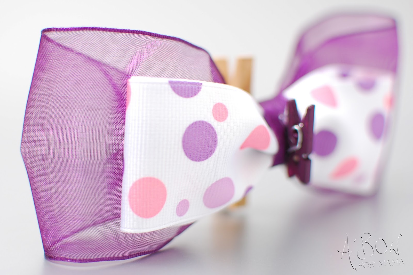
Now... you don't always need to think in solid backgrounds. I have several painted grey backdrops that I use.  Depending on the look for your shop, blog or other product use... these are great ways of adding texture or color, and creating a custom look. Just be careful not to get too over whelming with the amount of color or texture if you still want people looking at your product!


A gift from Colletta's Kitchen Sink during a swap I did!
Product Provided by: Streeter & Co

These are a couple of  custom backgrounds that I have hand painted - if you want to learn more about them you can visit my shop or email me directly!


Plus, Grey is not the only neutral in town!

Browns, tans, creams: Also great neutrals you can use for a variety of products, and colors. The tone of the background does really start stretching the limits of what colors look best on it. So you need to be careful here. Too yellow, red, or orange and your product may start to pick up those tones... especially in the whites. I tend to like something like the stone look below for shops with a more organic feel to them.
Product Provided by: Streeter & Co


While mixing a black with grey and brown provides another solid option for you, if you want something more custom looking but not so dark.

<<missing  new background image / Brice >>>>

Blues: Blues start getting very tricky. You have to use a little restraint and start thinking about your product and photography very seriously. It is easy to use the wrong kind of blue and to have that overwhelm your image like here you see the blue reflecting so much that the white starts to take on that tone like the image shown below.


Now, blue is still a very common color to use in studio photography. Typically you wont find it as a solid background, unless it is being used as the blue alternate to the green chroma key.  Where it is so overwhelming it is easily selected digitally and replaced with a different background. However, you will find it as a dyed background, or commonly paired with greys and whites in a mottled texture much like the tan and black are in  the image of "Brice" above.


There are exceptions to the rules and times when a solid blue can be your friend... say if your shooting something that is stone, or natural in color, seashells, or you want that "sea" look... stick with lighter shades of blues to accomplish this and help prevent the color bleed. Or if you have something that falls in the red, yellow, or orange category where you can use the blue to calm and add balance to the colors of the image, while highlighting the beauty of the product. Often it is best to work with something that has several shades of blue, or even white to help that balance.


Product Provided by: Crafty Gal Creations
Blues are very tricky for product photography, especially home product photography because you are typically not shooting with the best lighting gear. Poor lighting leads to blue images to start with... either from shadows, poor exposure, or the  light temperature of your light source.  My suggestion, stay away from solid blues and look for mottled, or pops of blue. Like this custom painted backdrop I made.
Product  provided by: Flynnster


Or by adding it in as a prop! Like this custom prop I created as part of Sweetsies Prop set. 

Cookies provided by: Sweetsies
Greens, reds, pinks, oranges and yellows: Unless you are a professional, and have the right equipment I would tend to steer you away from these background colors. Again, due to the nature of these colors they tend to bleed over into your product colors... reds and yellows are especially bad. Reds, quite frankly are even bad for you to WEAR during a photo shoot around your face, because it will make your skin appear more red and flush!


Not every item can stand up to such a bright background as well as this super cute guy... This type of bright background works great for kid products... but seriously.. you have to know what your doing or this will go very ---- VERY bad for you!

Plus, these colors will quickly overwhelm the eye.With skill and comprehension of the product and the equipment and lighting you have available, you can create great images with bright backgrounds. However,  if you are trying to create a custom look for your shop and that is a major part of your "branding" color scheme I would seriously consider letting me create a custom background where any of these color can be mixed into a more neutral based background, making it easier for you to work with! Too many images like the one above and potential shoppers could be easily overwhelmed! However, you should be aware of your product as well, below is a great example of a great background choice for yellow.  However, just like the blue we talked about a moment ago, it can bleed into your product... like below, this Smelly Jelly by Streeter &Co should be clear, instead it picks up the background color behind it and becomes more yellow itself! A lot of this can be overcome with proper lighting, and camera settings, but if you are starting out you may want to steer clear of the extra obstacles.


Patterns: Mixing up patterns and textures can be a lot of fun... I suggest being careful with the print and texture you use. I also find that people who don't have good lighting, or camera equipment, or who don't understand how to use it really struggle with making patterned backgrounds look good. Using depth of field and posing techniques to showcase an item becomes very important. Also, I wouldn't suggest posting a product like this lanyard with ONLY this image... make sure your following my other guidelines on using multiple images, posing, details and clarity! This can add interest to your shop... but it doesn't really show you want the item is!  - But seriously... HOW cute are the ladybug and bumble bee beads in there! I mean COME ON!

Product Provided by: Crafty Gal Creations
Golds/Silver or other reflective surfaces. These can look amazing. However, you really have to know what your doing. Since these backgrounds reflect light you want to work with that, instead of against it. Utilize your lighting to create a great effect. Like the patterns, I don't recommend this for your everyday image, or for someone just starting out... there is technique and an investment into time, lighting and camera gear required. However, when done right it can have a dramatic effect rather then just going with a black or grey.


Product Provided by: L.W.Hooks

Product Provided by: L.W.Hooks
It really makes for amazing detail shots! Much like the pattern, I wouldn't try to shoot all the images on a reflective background... just a standout... look at me, kind of shot. I've used the metal look to highlight the chain in the two crochet necklaces, and to pick up the sparkle in the threads of the crochet hat.


I hope this has gotten some wheels turning and helped you think about what you can use in your home studio! Don't forget to join me for "The Background, the final chapter" where I talk about what makes a good background, and what to look for when making or purchasing one, and how to pair the right colors with your product!